Timely
Building the conditions for better design decisions
When I joined Timely, the design team was already strong at qualitative research, finding problems and understanding what customers needed. What was missing was a clearer way to connect those insights to measurable design decisions and outcomes. Quantitative data existed, but it mostly lived at product level in revenue and conversion reporting. It was too far from the actual experience to help designers make faster calls.
After the calendar redesign showed I could bring a more analytical approach, the head of design promoted me to lead designer with a mission to bring that thinking to the wider team.
Where it started
My first project at Timely was the design system. To prove it worked in practice, I joined a product team redesigning the calendar and used it as a live test of a more measurable design approach.
Looking at utilisation, click patterns, screen recordings and support tickets together made one thing clear. The real problems were not visual inconsistency alone, but broken journeys. That work showed that behavioural data could surface those problems much faster than research alone, and gave us a stronger way to guide design decisions.
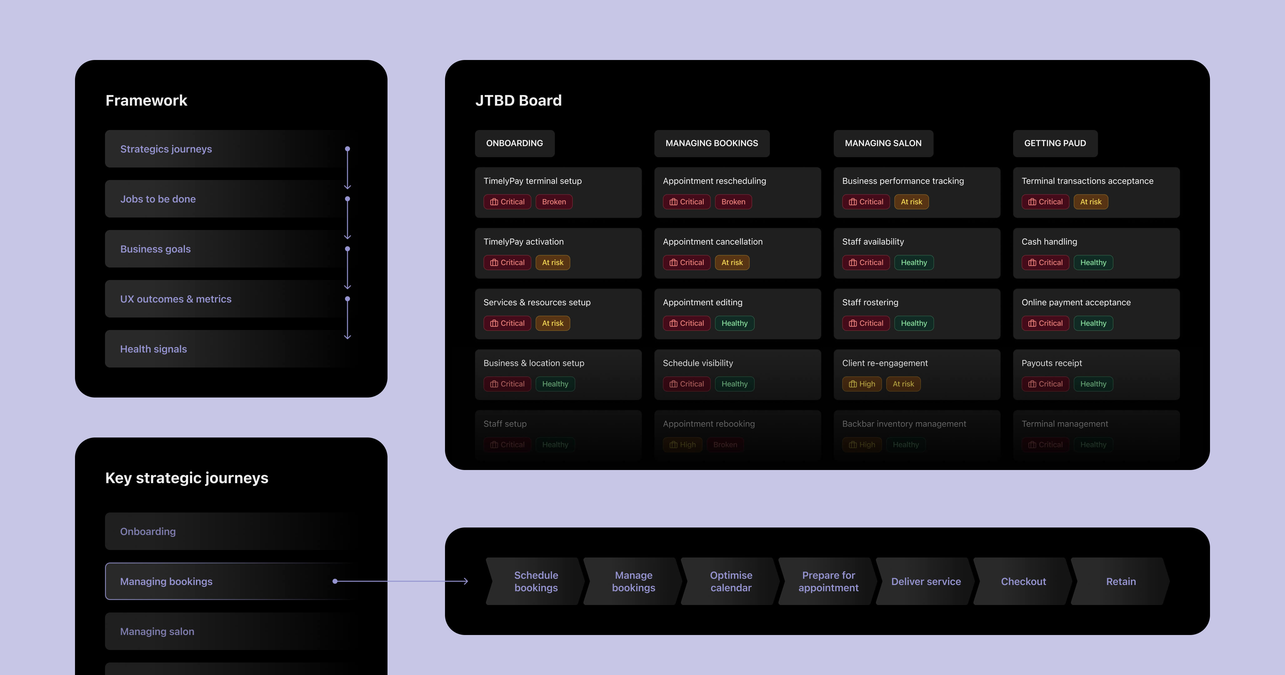
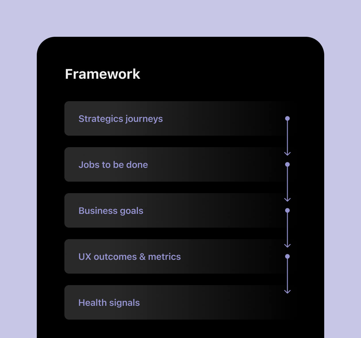
Building the framework
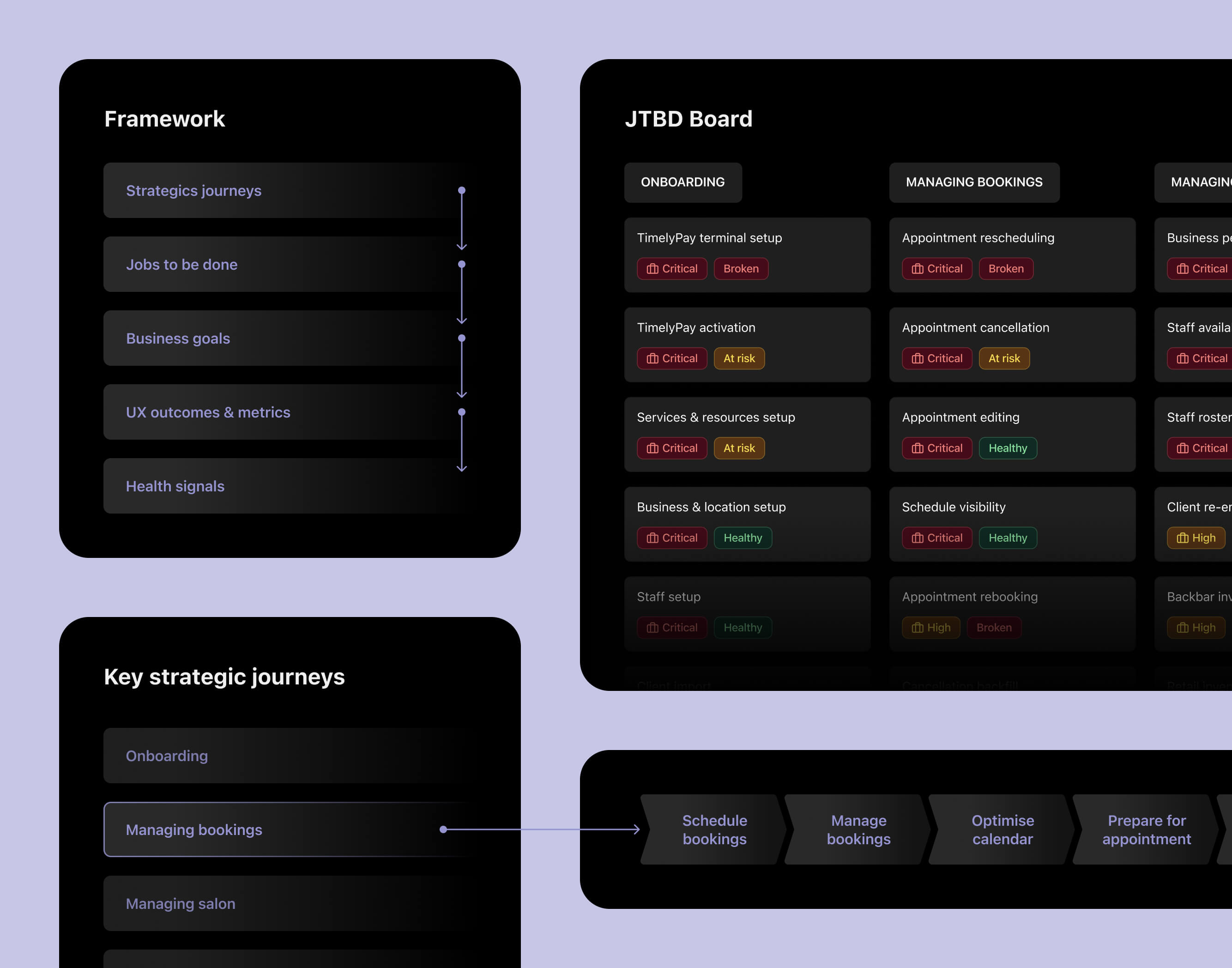
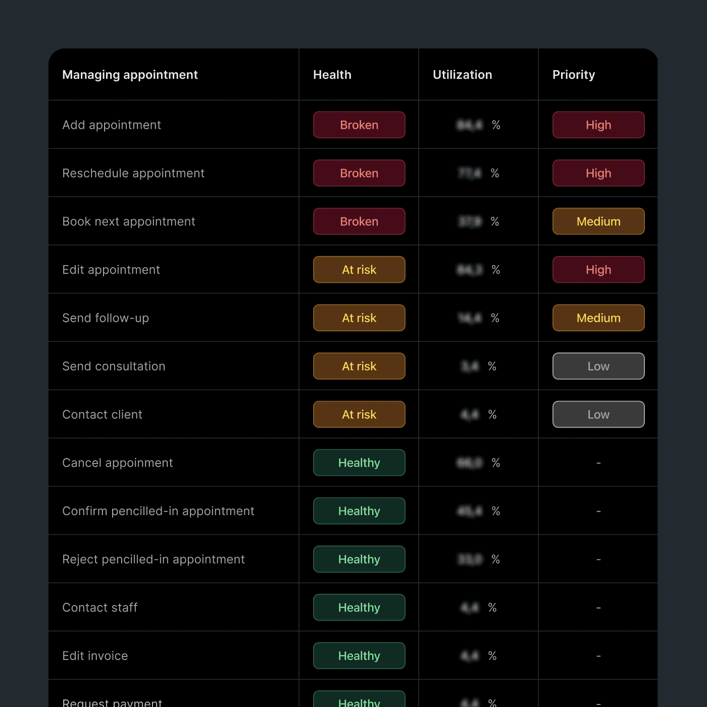
I started by mapping strategic journeys. Rather than using a lifecycle model that creates unclear ownership at the boundaries, I structured the work around what salons were actually trying to get done. Onboarding, managing bookings, managing the salon and getting paid. Each journey had clear enough scope to be owned by a specific team and connected directly to business goals.
I then worked with UX researchers to validate the structure and map the key jobs to be done within each journey. Qualitative research explained user intent. Quantitative data showed how important each job was in practice. Utilisation, drop-off points and task success signals determined whether a job was healthy, at risk or broken. That combination of validation and evidence meant the framework was grounded in real behaviour, not assumption, and each JTBD had a clear owner from the start.
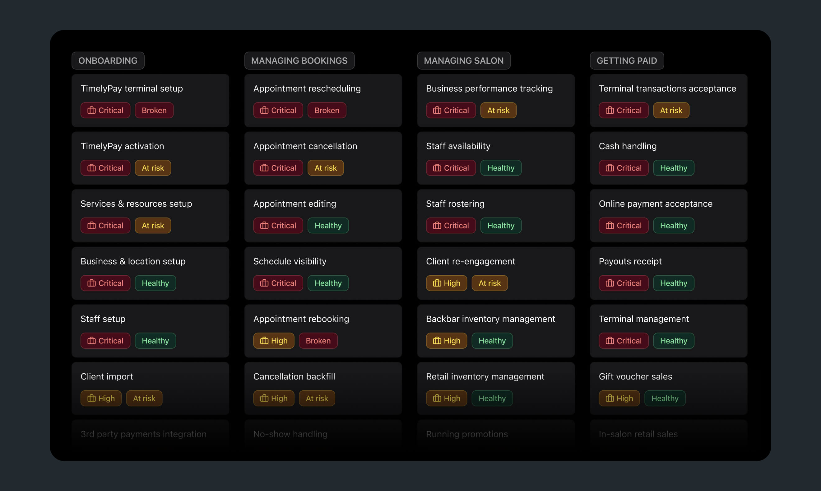
I was not trying to document everything. I was trying to create a decision system. The framework was a living reference, not a final deliverable. I led other designers to take ownership of the journeys they were working on. Each job was linked to UX metrics and to the OKRs their product team was already accountable for, which made adoption easier because it sat inside the work rather than beside it.
The distinction I cared most about was leading versus lagging metrics. Revenue and conversion move too slowly to guide iteration. Task success rates, time on task and funnel completion respond much faster, giving designers something they can act on without waiting months to learn whether a change helped.
Putting it into practice with TimelyPay terminal
The framework flagged payment terminal setup as both critical and broken. The journey from requesting access to completing the first transaction had never been properly measured. I worked with the data team to define the event taxonomy and metric definitions for the full journey, then used Snowflake and PowerBI to build a dashboard that showed the flow end to end.
Once we could see the journey clearly, the main problem was obvious. The biggest drop-off happened during activation. Average wait time was around 12 hours, sometimes up to 72. For new users, that delay was enough to stop progress completely.
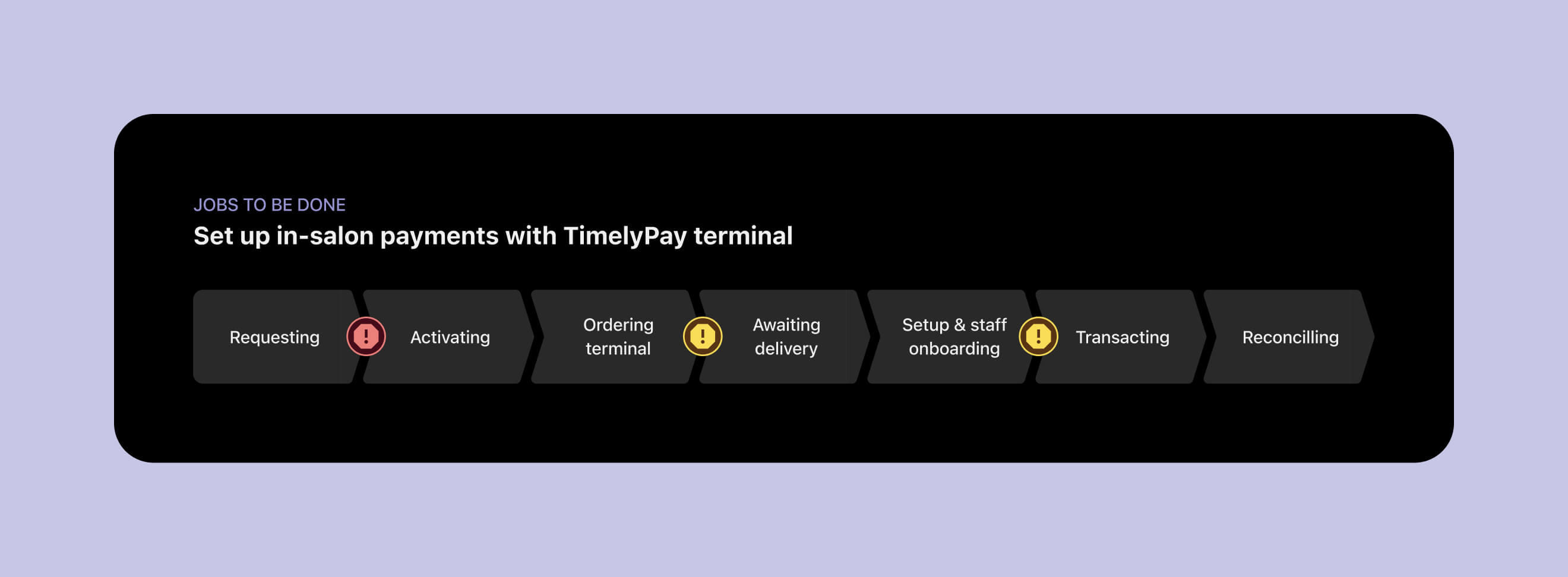
The problem sat across product and operations. Most of the wait was not a technical constraint. It was an anti-fraud process that had become manual by default. Working with risk and operations, we separated low-risk users, who could be approved almost instantly through automated fraud checks, from cases that genuinely needed review. Applications that still had to be manually reviewed pointed to another fixable problem: most failed because of missing or outdated business information.
Fraud did not increase. We tracked that for more than three months with no new peaks, and the improvement was confirmed as an official outcome. Activation time dropped from hours to instant for the majority of users. Manual cases moved from days to a few hours.
What changed
The biggest shift was not the framework itself. It was how designers started to think about their role. They began owning metrics they had not owned before. The framework gave them a structure for choosing the right metric for a journey, tracking it and using it to support design decisions without always needing engineering involvement.
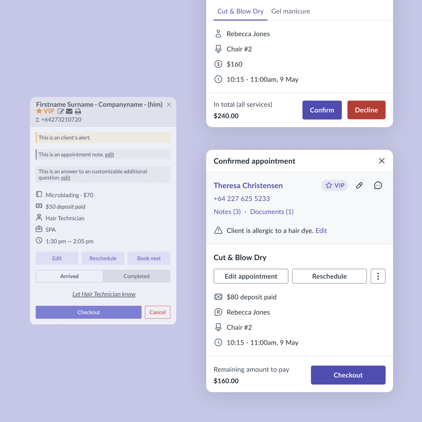
Some of that tracking was intentionally approximate. A rebooking rate defined as clicking rebook and saving within two minutes is not perfect, but it is fast and directionally honest. Getting to a useful answer quickly was often more valuable than waiting for a cleaner dataset that arrived too late to shape the work.
What I learned
The most useful shift was changing what designers thought their job included. Owning a metric, defining it, tracking it and reporting on it does not have to sit only with product managers or analysts. Once designers had a structure and working examples, they were much more confident doing that work themselves. A signal that moves within a week changes how teams prioritise and how quickly they can tell whether something is improving.

